Commerce7 Lite — Built for small wineries. $59/month. No transaction fees. Learn more
Merchandising Your Product Pages Like It's 2018
Andrew Kamphuis 2 min
Nov 14, 2018Retailers have been merchandising their store aisles for years. A lot of thought goes into the location, display, and placement of products.
A savvy retailer has product callouts all over their aisles, they have items at the end of an aisle, and items in bins in the middle of an aisle. They create attractive/interesting floor displays. Staple items such as milk are kept in the back of the store to make you wander through a maze of merchandise. Their checkout line is tactifuly littered with impulse products. Product placement matters. Everything is done to maximize sales.
As a winery, you probably go further than a typical retail store. Aisles flow different ways (or there is a lack of aisles), you have awards and medals around specific wines, you might have a wine with “limited quantity” or “club member only” signage. You create a lot of unique and interesting displays. You control the colors, sounds, smells, and temperature to deliver an optimal customer experience.
But what happens on your website?
Merchandising Online
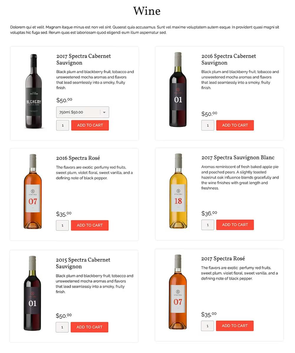
Why do so many ecommerce websites look like this?

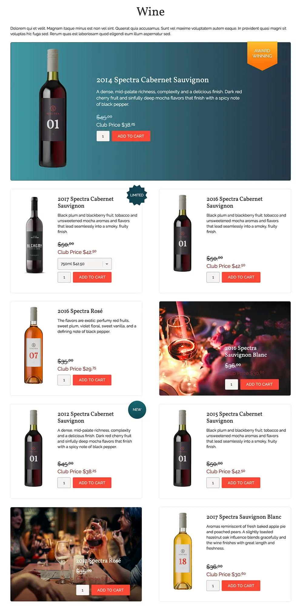
Shouldn't the page look more like this?

Don’t we want a “feature” wine at the top, and a couple call outs down the page? Products on sale, in limited quantity, or new to the store should pop out to us. Club member pricing should be visible up front.
Your website product page should be designed to guide the customer through purchasing your product.
For my software developer friends reading this - shouldn’t our ecommerce software do this by default? Our software should by default “merchandise” the product page rather than put products into boring columns.
As a winery, you put a lot of thought and strategy into the placement of your wines in your tasting room, it's time to do the same online.
--
Ready to create better shopping experiences?
See Commerce7 firsthand by scheduling a demo with our team.
Schedule a Demo